Currently, Quantified Prestige doesn’t have a logo. That’s not so good. A catchy logo would help to spread QP as a meme and make it more memorable. Also, it would indicate that we are a bit more serious about turning QP into a real thing than without having a logo.
Firstly, we should get clear about what we want to express with the logo. There are many aspects which can and should be associated with Quantified Prestige:
- positive reputation / prestige
- peer to peer (esteem) – as opposed to top-down or algorithmic reputation
- gratification / gift economy
- digital abundance (as purpose and goal of QP)
- ideally decentralization
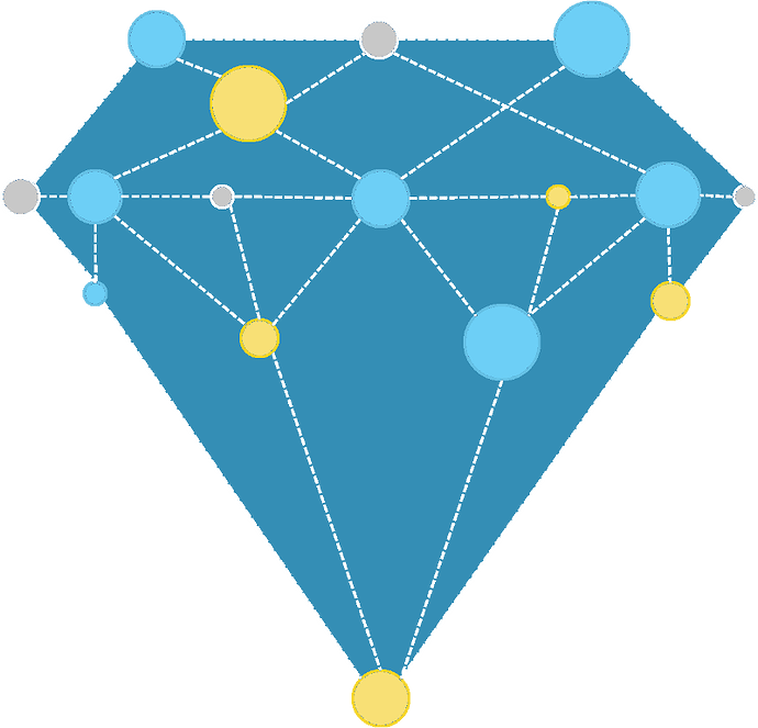
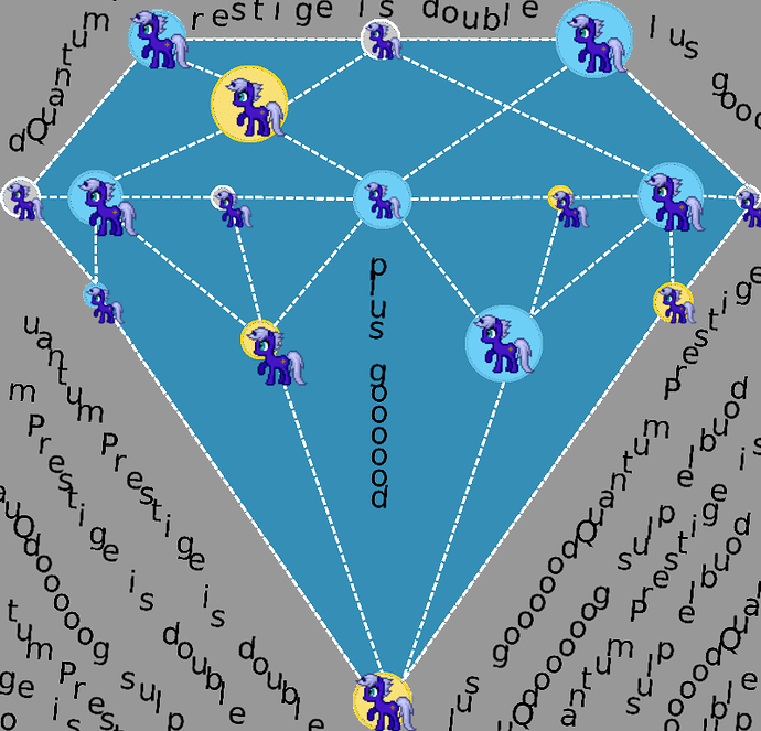
The following is an image I made with the Fractal Generator, and which features the hues 51 (gold) and 231 (a blue hue that’s complementary to gold), with the latter desaturated, which grants it somewhat of an indigo or lavender slant.
The use of the colour gold to indicate wealth and prestige may not be the best one. Interesting alternatives might be platinum or diamond, but their colours are not as easily discerned and thus the association with abundance and prestige might be lost.
Now when it comes to the logo, it seems to be intuitive to use the letters “QP” for it, but would that really be the best choice? What about a logo without letters, which signifies the underlying ideas with symbols? When it comes to allocation of esteem, one might think about a network in which “+”, “thumbs up”, “hearts”, or “upwards pointing triangles” (see Reddit) are sent around in various quantities. There are problems with each of those:
- “+” may feel too mathematical and abstract
- “thumbs up” may create a too intimate association with Facebook, which would be problematic
- “hearts” might rather tend to suggest associations with dating sites
- “upwards pointing triangles” are hard to interpret and might be confused with mountains
The QP logo should look good and create positive feelings in those who see it. It should be seen as something one wants to be part of. I know this is hard to do for a logo that first needs to acquire meaning though the context in which it is displayed, but the logo at least must not contradict the general positive message of Quantified Prestige.
Any ideas? Feel free to brainstorm here… ![]()
