Hey all, I’ve decided to finally rename the Social Future Metanet into the Fractal Future Network. During the discussion about the name for this community no clear alternative candidate emerged, so the decision was between keeping the name and changing it to Fractal Future Network. I have explained my reasons for this step in the thread “Renaming Social Future to Fractal Future?”.
Today I’ve registered the domain fractalfuture.net, so that part of the plan is already done.
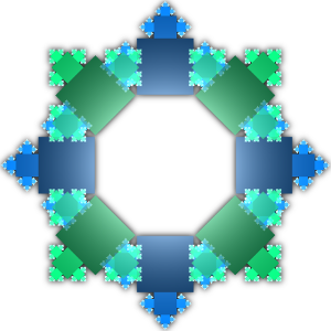
Just now I’ve created a first logo for the Fractal Future Network:
I hope you like it. The fractal F stands for “Fractal Future” and the fractal squares stand for the network that is itself composed of various networks of different colours. I think the logo looks cool enough for the beginning
So, what are the next steps?
I’ll set up a VPS for the portal page based on a wordpress blog
I’ll announce the launch of the Fractal Future Network
All of this may seem a bit rushed, but I thought it would be good to do this change sooner rather than later. My next plan is to launch the REPDEV (Reputation Economy Promotion, Development, Exploration, and Vitalization) Network which will first use the infrastructure of the Fractal Future Network. At that point the Fractal Future Network will have three major projects:
The Fractal Cosmos sci-fi world building project
The REPDEV network
The Transhumanist Party discussion boards
More projects can come later, too, of course. But I first wanted a stable name and a domain that can be remembered easily: FractalFuture.Net
The database migration seemed to work. I still need to adjust some settings and change the logos. Please stay tuned. And please report any errors if you find any!
It seems like the new forum is basically working now. There’s still one important thing to do: Create a full logo for the forum with the name “Fractal Future Forum” in it. I’ve googled “fractal” fonts, but they don’t look very appealing to me. Something more “freestyle” could be nice. Or just taking an awesome font and adding special effects or something. If you have a good idea, please be creative
I’ve made a top logo for the Fractal Future Forum using the “Neuropolitical” font. I’ve used an emboss and a “cubism” filter to make the text look kinda “fractalized”:
It may feel like a bit “too much” or too “wild” or even unsettling, but I think it does look kinda interesting and intriguing. Also futuristic.
Alternative suggestions are always welcome, of course!